Sector: Real estate
CAM Variance Case Study
Challenge
The organization's historic performance of property dashboard needs to be redesigned to better connect with its audiences, including building a more intuitive navigation architecture and developing a coherent visual language.
My Role
UX research Facilitation, Information Architecture, User testing, Prototyping, Dashboard design
I was the sole UX & frontend engineer to create a corporate bond trading dashboard.
Project Time
3 weeks (before handoff to development)
WHY OUR PRODUCT?
But what happens as soon as the user finds the right variance of the property? How can we help employees track their finding and optimize for their next customer?
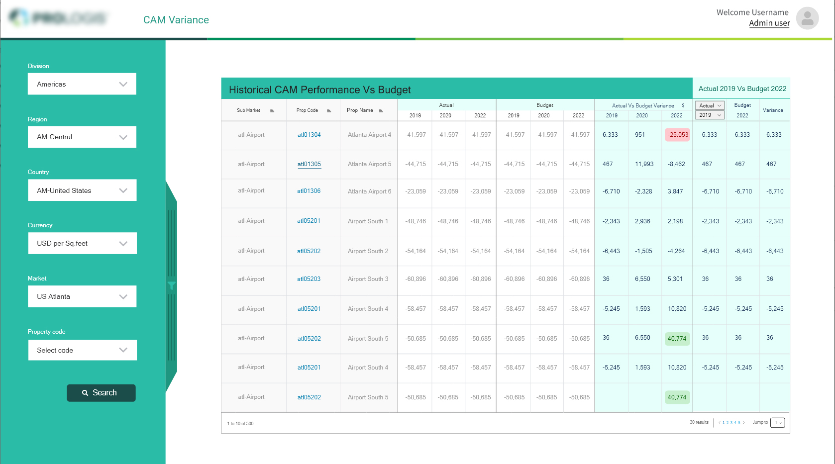
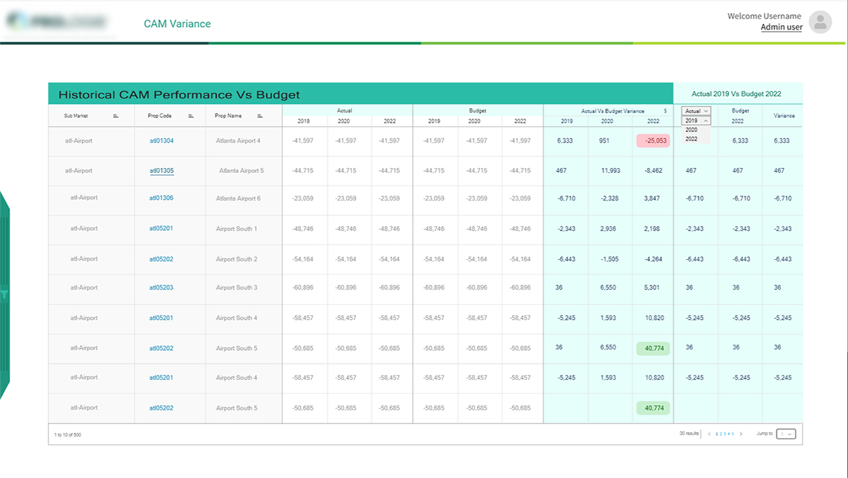
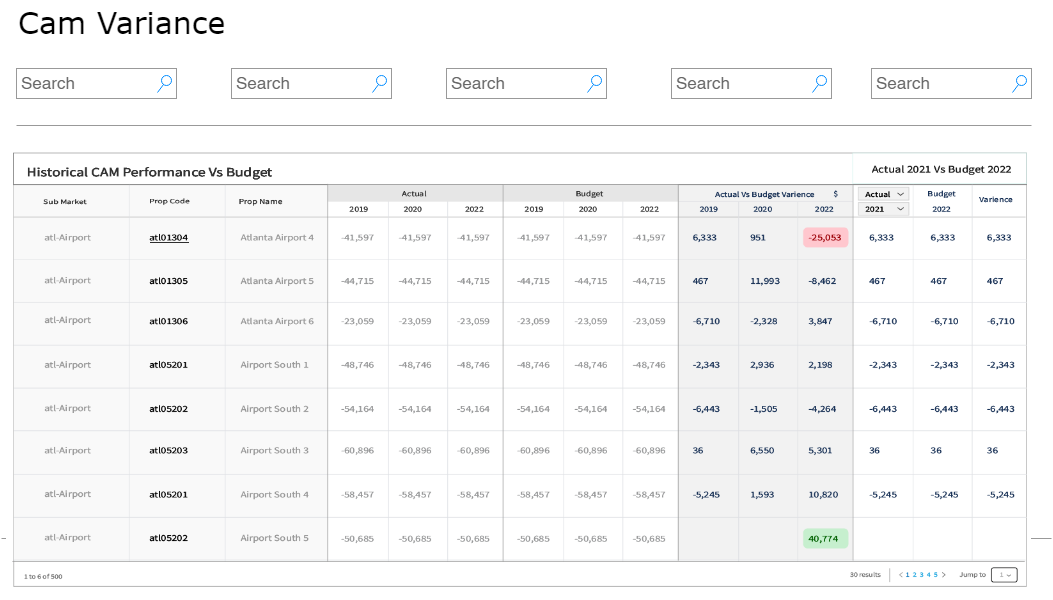
CAM Variance dashboard is a feature that’s frequently seen by users as it is the first page one would land upon when they login. However, our data shows that majority of our users spend long time on this page as we suspect it did little to add value to their experience.
Talking to end users
I found out that our target user would be the sales team/employees.
In order to understand this persona a bit more, I spoke to our product owner, stakeholder, business analysts and sales team of the client. By doing this, I could also capture how they were using the current dashboard and what value they took from it.
Some of their major pain points came from the missed focus of the dashboard:
Crowded
Filters
Ease to use
Problem
I noticed there were functionalities that didn’t quite belong. Visually, there was also a lack of hierarchy and priority in the way information was presented.
I also looked at other dashboards of popular platforms to further my research on what a useful dashboard is comprised of. Some takeaways of what made them successful included:
- Well structured navigation
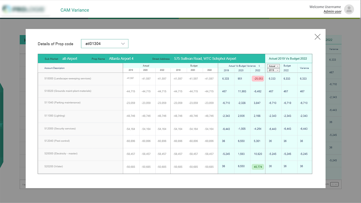
- Informative data that is actionable
- Data presented in filterable timelines
- Insights shown at different milestones
Main Objective
This feature was important for us to improve in order to relieve pain points that the users encounter, especially around their journey of preparing the analysis of the historic data.
We determined that our main objective is to increase ease of use and to generate the report based on their search criteria.


Starting with Questions...
We created a list of ‘How Might We…’ questions to help us better align our user’s tasks and goals:
- How might we provide an experience that is engaging and valuable to our users?
- How might we allow them to access their most critical event information through their mobile devices
- How might we provide a tailored experience that allows organizers to see what’s most important to them?
The Redesign Process
Card Sorting
I ran a card sorting session that was composed of members from our Sales and Support teams. I used this technique to determine which functionalities of the dashboard should stay, and which has to be eliminated based on our platform’s information architecture and how much value it was adding on our dashboard.
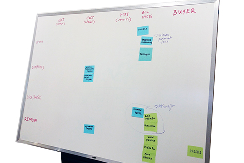
Internal Feedback
I sent out a survey to our client-facing teammates to quickly inquire what should be added or removed from our dashboard. The purpose of this was to discover potential quick wins on simple improvements that could be executed quickly.
Response from internal survey
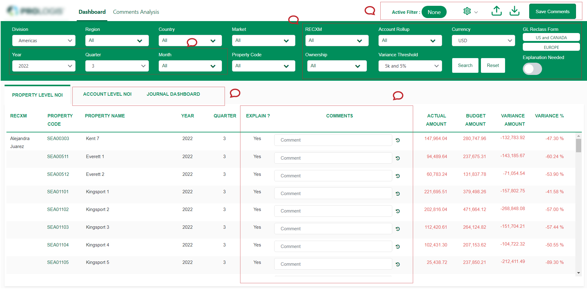
[We need] more property level reporting. More account level changes i.e. adding property codes. Ability to see info on certain reports at-a-glance
Some of the feedback we got back was:
• The filter area consuming too much space hence available space to show the report is less.
• Too much of filtering options which confuses the user!
The Wireframe
To validate these findings, I designed a simple overview of the landing page, two options where provided one with the filtering options on top and one on the left side.
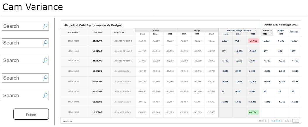
A/B testing
After soft launching to a smaller set of actual users, we started to see a difference immediately. Our clients expressed the usefulness of these the layout with filtering options on the left side
Iterate, Iterate and Iterate
Based on our all of our findings shown above, we narrowed our focus into 3 areas for potential improvement of our original dashboard:
- Improve navigation
- Improve the data we provide
- Improve actionability
Solution
The MVP
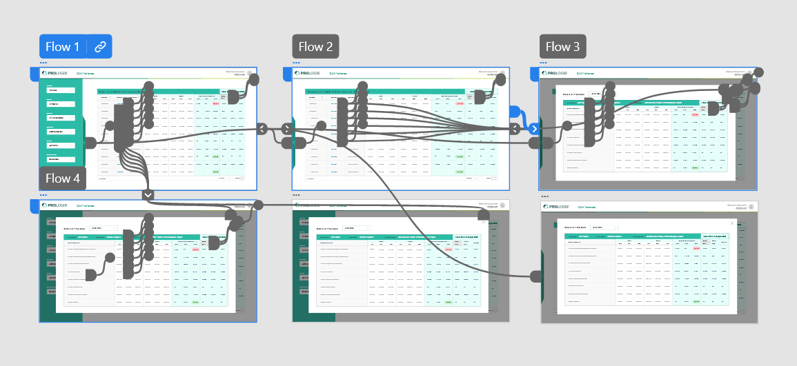
To validate these findings, I designed a simple clickable prototype in Adobe XD, and given for user testing which was changed again and again as per suggestions/feedbacks we received.
Challenges and Compromises
To validate these findings, I designed a simple clickable prototype in Adobe XD, and given for user testing which was changed again and again as per suggestions/feedbacks we received.
- In one version, I wanted to include a map of where an event’s top buyers were located. Instead of developing a map, I scoped it down to showing a list of where these buyers were from.
- I included in-app messaging showing summaries of your event once it ended. Since this would require extra time for developer complexity and logic, we transformed this into a post-event email summarizing net sales and properties sold.
Next Steps
The released version of the dashboard has been well received by our customers. However, there are still improvements that can be made. An event organizer should be able to filter their data even more, and customize the view based on their needs.
We helped revised a foundation that allowed us to build on top of, adding in a home for global level features and functionality such as Account Level Discount Codes. The patterns and designs created would later help inform future parts of the product as we constantly strive to improve our Event Organizers’ experience.