Sector: Logistics
DQHQ Case Study
Challenge
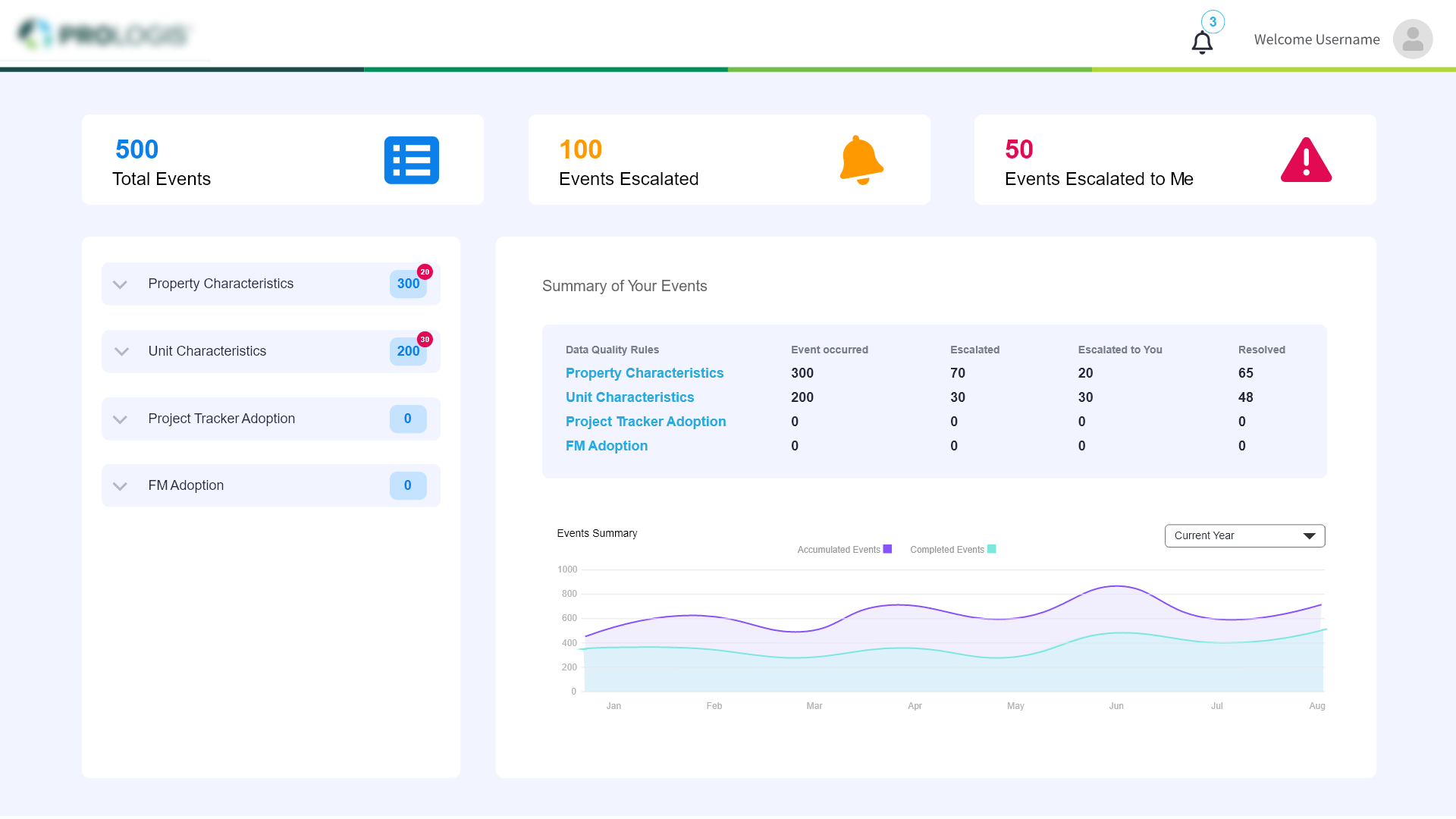
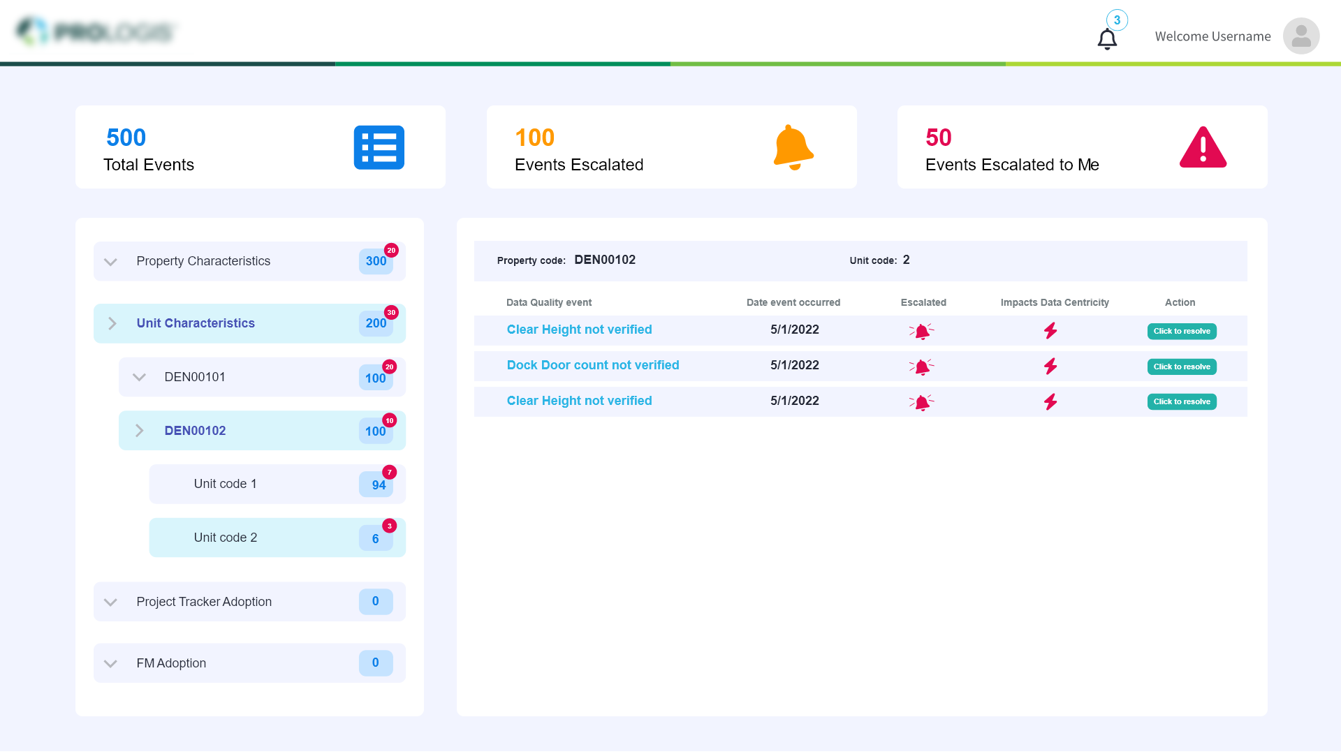
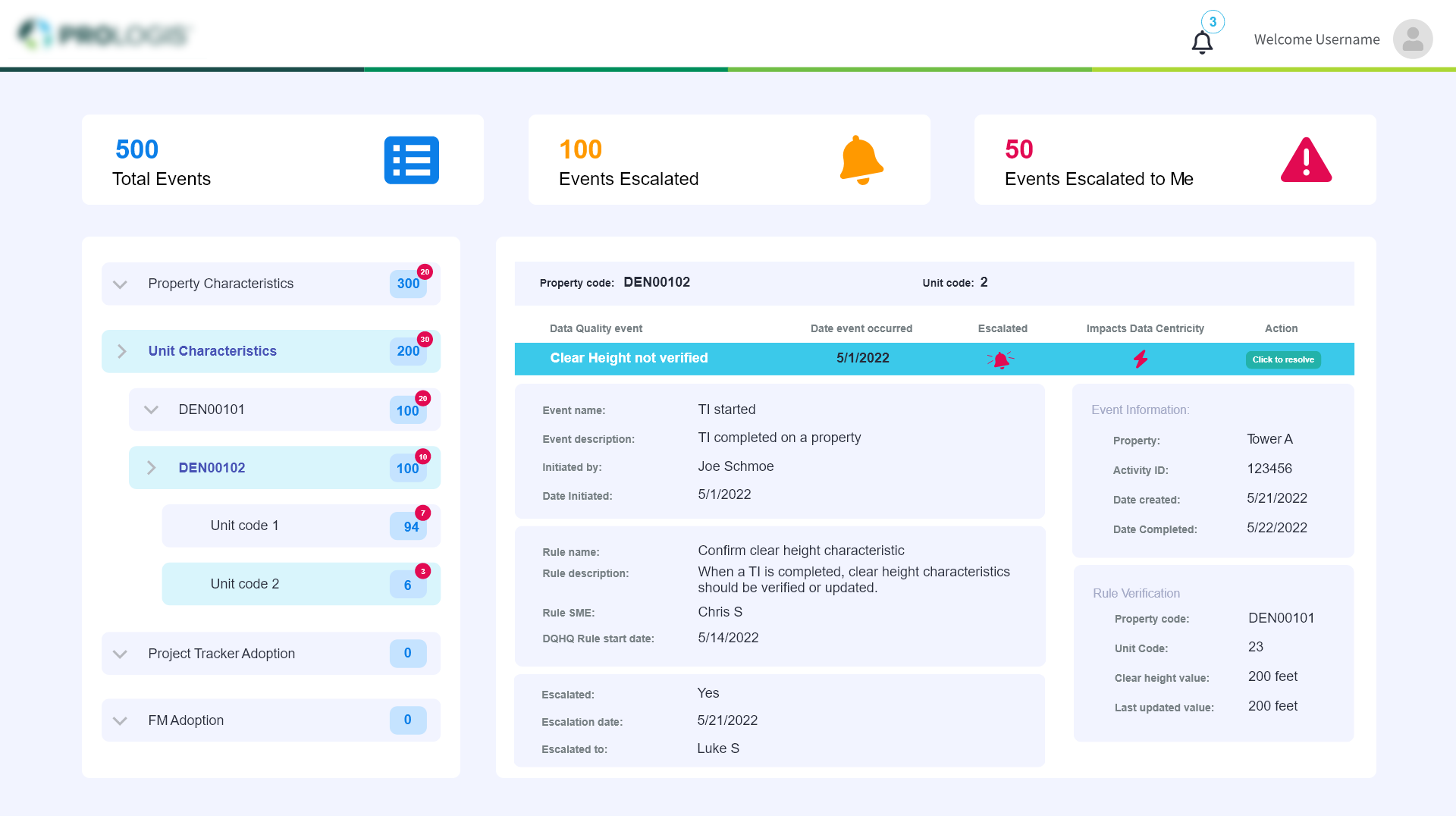
Data Quality Headquarters dashboard. The underlying idea is that after an event takes place, a rule or set of rules is applied to that event to check for quality or the completion of other tasks. With the help of this web application, users will have access to a central location where they can view all the items that have been assigned to them as responsibility for resolving data quality incidents.
My Role
UX research Facilitation, Information Architecture, Prototyping, User Testing, Dashboard design
I was the sole UX & frontend engineer to create the Visual design of the dashboard.
Project Time
4 weeks (before handoff to development)
WHY OUR PRODUCT?
The employees need a tool that allows them to view all the tasks that have been given to them for handling data quality incidents.
Is it necessary to display all tasks assigned to other users or just those assigned to me and by me?
Ease of use is critical because it reduces operating costs and allows users to select exactly what they want.
Talking to end users
I observed that our intended audience would be the organization's employees.
I spoke with our product owner, stakeholder, business analyst, and many other employees in order to better grasp this persona. I wanted to better understand their psychological makeup and what they were specifically seeking from this application.
They had a number of important needs for this application, including
Notification
Transparent
Precise
Problem
The underlying problem is the absence of an appropriate real-time visualisation tool for the events assigned to them and to track the events assigned to others.
To assign a task or manage the event in an Excel file, they are currently exchanging busy emails.
Main Objective
There isn't a standardised tool for keeping track of every event's status.
We came to the conclusion that our primary goals are to make the system easier to use and to determine the jobs that have been delegated to users and by users to other users.
- Simplify the structure and easy access to the events
- Events assigned to me escalated by me
- Make it fast and easy to use for everyone
- Clear information section for each events


Starting with Questions...
We created a list of ‘How & What’ questions to help us better align our user’s tasks:
- What kind of interesting and worthwhile experience can we offer to our users?
- How can we give them access to the events they were assigned to and the ones they escalated?
- How could we provide users the opportunity to view what matters to them the most?
The Design Process
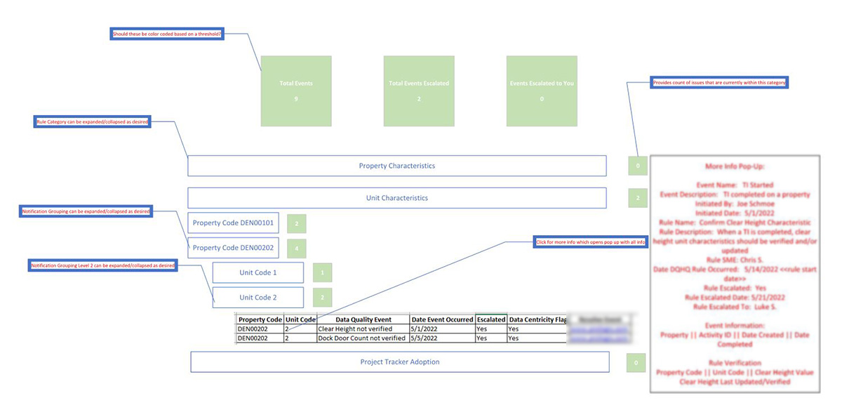
The Wireframe
A simple scribble of the Dashboard
User Interviews Again
We have additional discussions with end users to understand their actual userflow and thoughts. Their recommendations were valuable and enhanced the final product.
Iterate, Iterate and Iterate
Based on all of our results, I made an effort to produce mockups by following all the design principles.
Solution
The MVP
I created a straightforward clickable prototype with the right userflow to test these conclusions, and continually modified it in response to user input and ideas.
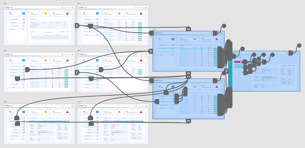
We saw results right away after soft launching to a smaller group of actual people. Our customers praised the layout's usability. I designed a simple clickable prototype and given for user testing
Challenges and Compromises
The events and escalations had to be restricted to only the one user who logs in. In order to make the application straightforward, lightweight, and simple to use. The user won't be able to see other users' escalations and events.
Next Steps
Our consumers have been pleased with the dashboard's newly released version. However, there is still room for improvement.